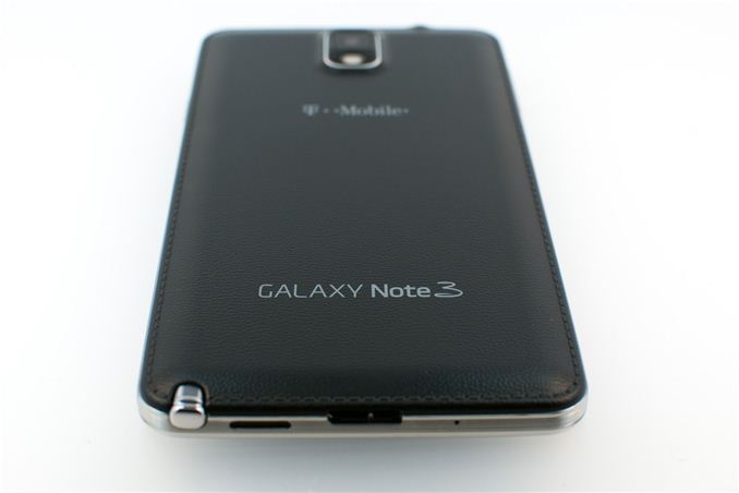
 I still remember the first time I held the original Galaxy Note. At
that point in time it wasn’t really obvious just how critical
larger-display smartphones were going to be in the future, nor just how
close the smartphone market was to becoming a mature one. In a mature
market it’s all about filling in the niches, something Samsung has been
doing since the very beginning by casting a very large form factor net
with its lineup of android devices.
I still remember the first time I held the original Galaxy Note. At
that point in time it wasn’t really obvious just how critical
larger-display smartphones were going to be in the future, nor just how
close the smartphone market was to becoming a mature one. In a mature
market it’s all about filling in the niches, something Samsung has been
doing since the very beginning by casting a very large form factor net
with its lineup of android devices.I remember being intrigued with the original Note more for the active digitizer feature (S-Pen) than the large display. It was during the height of the draw something craze, and having a stylus seemed like a logical advantage. Two years I lean the other way entirely, it’s that bigger display that makes me interested in the form factor not just as a curiosity but as something I actually want to use daily.
This is now Samsung’s third Galaxy Note, and as the adage goes hopefully third time is indeed a charm. Not that the first two weren’t wildly popular to begin with, either.
The Note 3 is obviously an iterative product with iterative improvements. The basic formula of the Note is unchanged - huge display, bumped specs versus the S series flagship, and active digitizer pen. The improvements this time are bigger display while making the overall device dimensions smaller, much faster SoC, higher resolution display, better camera, and all the improvements around the edges you’d expect (802.11ac, USB 3.0, IR).
I always start out by talking about the industrial design, appearance, and feel of devices, and won’t change that with the Note 3. Let’s just say it - the design of the Note 3 honestly isn’t a significant departure from Samsung’s norm. Then again nobody should’ve expected a huge departure to begin with.
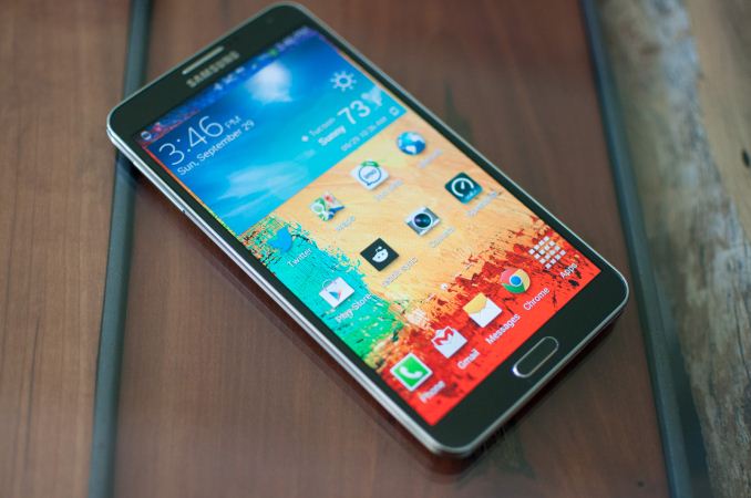
Whereas the Note 2 felt and looked a lot like a blown up SGS3, the Note 3 is likewise a bit like a larger SGS4, although I honestly see bits of SGS2 in it. The front is home to the huge display, the same kind of earpiece grille we always see from Samsung, front facing camera, physical home button, and capacitive menu and back buttons.
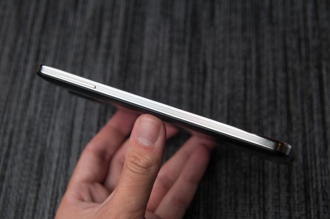
The edge of the Note 3 is ringed with the familiar chrome, although this time there’s a ridge which makes it more grippy. With bigger phones making the edges less slippery is important, the Note 3 hits the mark here nicely.
All the buttons are also in the usual places for Samsung, and feel great. Power is easy to get to, the volume rocker as well is nicely positioned.
Headphone jack and the IR port are up top, along with one of the 3 microphones used for noise cancelation on the Note 3.
There’s another microphone on the bottom right of the device, and the third is at the bottom to the left of the microUSB 3.0 type B connector jack.
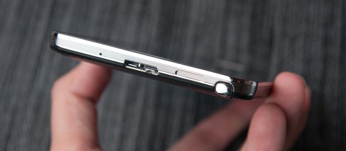
There’s been a lot of talk about the presence of USB 3.0, even though the micro B connector type has been around for considerable time already and in a ton of devices. The Note 3 just has the misfortune of apparently being many people’s first exposure to the connector, whose awkward double lobed shape gives it forwards compatibility with microUSB 2.0. The rightmost region is just the familiar microUSB 2.0 connector, the left contains the pins for SuperSpeed signaling for 3.0. Plug something into the right 2.0 jack and you get 2.0 speed for transfers and charging. 3.0 at present should give you faster transfer rate (it doesn't in practice as you'll soon see), and eventually faster charging, but the Note 3 continues to use Samsung’s 2.0 amp charging spec and rate, but more on that later.
| Samsung Galaxy Note 3 (T-Mobile SM-N900T) |
|
| SoC | 2.3 GHz Qualcomm Snapdragon 800 (MSM8974) 4x Krait 400 @ 2.3 GHz, Adreno 330 at 450 MHz |
| Display | 5.7-inch Super AMOLED (1080p) |
| RAM | 3 GB LPDDR3 |
| WiFi | 802.11a/b/g/n/ac (BCM4339) + BT 4.0 |
| Storage | 32 / 64 GB + microSDXC (up to 64 GB) |
| I/O | microUSB 3.0, MHL 2.0, IR LED (remote), NFC |
| OS | Android 4.3 |
| Battery | 3200 mAh, 3.8V, 12.1 Whr |
| Size / Mass | 151.2 x 79.2 x 8.3mm, 168g |
| Camera | 13 MP w/AF, LED (Rear Facing) – 1080p60, 720p120, 4k30 2 MP (Front Facing) |
Whereas most of the Note 3 is par for the course for Samsung device design, the backside is something different entirely. Instead of the slick plastic that we normally get out of the Korean handset makers, the Note 3 backside material is plastic, textured to look like a leather bound book complete with faux stitching, and in the case of the black color, topped with a somewhat grippy rubbery finish. The white model doesn’t get that rubbery finish, and instead just feels like somewhat roughly textured plastic with the same faux leather pattern. I’ve held pleather, fake leather, and real leather, and this frankly isn’t any of that. It’s still injection molded plastic, but this time patterned so it looks vaguely leather.
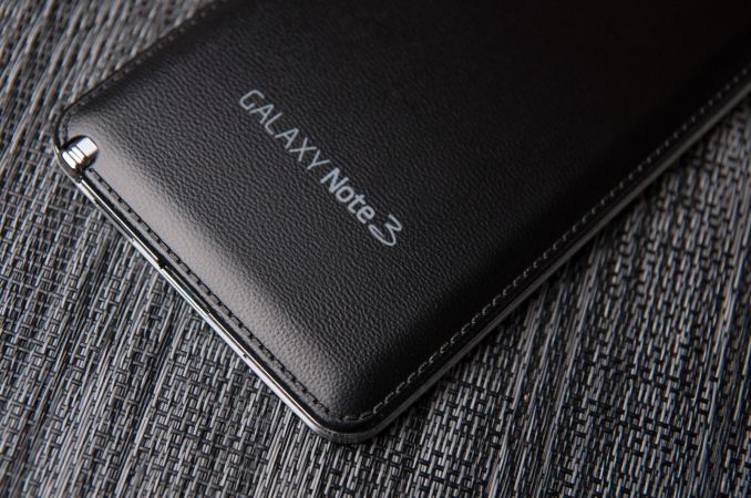
Samsung does deserve kudos for not just giving us another slimy-backed phone with a glossy plastic battery cover, however. I have to admit I do like the rubber finish on the black Note 3 I was sampled, as the white one feels significantly different as it lacks that finish. The only downside is that it does pick up and show hand grease, whereas the white one handles it better. I could do without the fake stitching though.
Hands vary in size, and what size device is “best” for someone is really just a matter of personal taste. Some people are clamoring for smaller devices, others want bigger - as this market matures, success for OEMs will mean a diverse portfolio filling in all the obvious form factors.
More and more I’m starting to think the width of devices is the pain point that causes real fatigue, and edge bezel thickness. The Note 3 does very well here compared to its predecessor because it’s thinner, and lighter. In fact, you could pretty much sum up the Note 3 with – thinner, lighter, faster, oh and it has a bigger display at the same time.
| Galaxy Note 3 (T-Mobile) |
Galaxy Note 2 (T-Mobile) |
Galaxy Note (AT&T) |
|
| Height | 151.2 mm | 151.1 mm | 146.85 mm |
| Width | 79.2 mm | 80.5 mm | 82.95 mm |
| Thickness | 8.3 mm | 9.4 mm | 9.65 mm |
| Mass | 168 grams | 180 grams | 178 grams |
| Display Size | 5.7-inch | 5.5-inches | 5.3-inches |
| Display Resolution | 1920 x 1080 | 1280 x 720 | 1280 x 800 |
| SoC | 2.3 GHz Snapdragon 800 (4x Krait 400) | 1.6 GHz Samsung Exynos 4412 (4x Cortex A9) | 1.4 GHz Qualcomm Snapdragon (APQ8060 - 2x Scorpion) |
| Camera | 13 MP with LED | 8 MP with LED | 8 MP with LED |
| Battery | 3200 mAh, 3.8V, 12.16 Whr | 3100 mAh, 3.8V, 11.78 Whr | 2500 mAh, 3.7V, 9.25 Whr |
I really want to use the Note 3 a lot more this time, since having more display real estate does make me feel like I can accomplish more. Obviously multimedia content also benefits from a larger viewport as well. Since I haven’t ever really been a tablet person, larger phones seem like a logical tradeoff.
Honestly the Note 3 feels better than its predecessor, and the biggest reasons for that are the textured rubberized back, grippier textured edge, thinner body, and thinner width. Oh and there’s no creakiness or build quality issues to speak of, in spite of being so large the Note 3 is very rigid and solid.
No comments:
Post a Comment