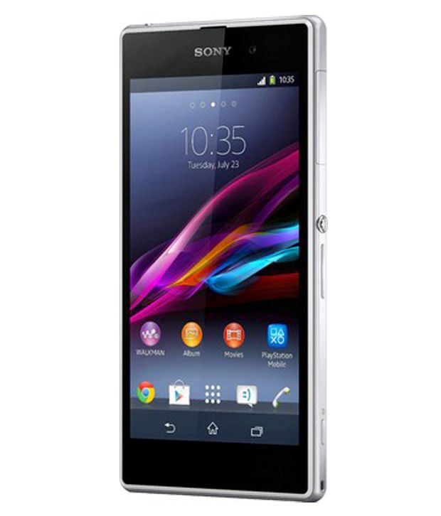
 Sony was the first of the big-name manufacturers to launch a new 2013 flagship smartphone back in March, with the Sony Xperia Z, a 5-inch model outwardly rather similar to the new Sony Xperia Z1.
The Xperia Z beat the HTC One and Samsung Galaxy S4 to market, offering a quad-core processor, 1080p display, 13 megapixel camera, 2GB of RAM, and water and dust resistance. It was awesome. And still is, seeing as so little time has passed since it arrived.
But now there's a new Sony flagship for theautumn/winter season, in the large, glossy shape of the Xperia Z1. There's a more powerful processor inside, a higher-spec camera and a new metal chassis, but it's still recognisably related to the older Z, both in design terms and the software it runs.
Price In India : MRP - 44990
In Market U Will Get in Lower Than MRP.
It's a premium model too, with the Z1 currently being sold direct from Sony for a stonking great £599 in the UK, the price you pay for a metallic, 5-inch machine, powered by what's generally agreed to be the fastest and most capable mobile processor available today. Given the Xperia Z's only seven months old and was no slouch, is there really a need for the Z1 upgrade so soon after?


We thought the addition of a flap over the USB connector would be a textbook first-world problem causing frustration on a daily basis, but no. It pops out easily. It pops back in easily. It's a second and a half worth investing each day in return for a fully waterproof phone.
Holding the Sony Xperia Z1 is a treat to the senses too, as the Z1 features a full glass exterior as well as a smooth, featureless and button-free front. The back's so shiny you could mistake it for a display, albeit a broken display that's stuck showing the Sony logo in the middle.
Sony's designers have ensured that the Z1's plastic sides extend by a fraction of a millimetre over the phone's glassy rear. This acts as a shock absorber and means the glass should be protected from casual tosses onto hard surfaces - although we've scratched the back a little already. But that was probably from chucking it in the sea to check its water resistance, so we have only ourselves to blame.

Sony's also stuck with its idea of putting the power button on the side of the phone a little above the middle, meaning it's easy to find and naturally appears where your fingers tend to sit when holding a phone of this size.

Thanks to the positioning of the power button it is just about possible to use the Xperia Z1 in one hand. It's not entirely comfortable to hold, though, as the angular slab design and glass back has you panicking that it's a very droppable item. Your fingers end up seeking out the docking port as the only gripping spot, as that's the only feature on the left-hand side of the Z1 that isn't completely smooth and flush.
The front... no, wait, this is the back. The back looks like the front. It's all glass and smooth, although we suspect it's not made from stuff as tough as that which covers the front, as a fair few tiny scratches have developed in a little over a week of use.

The SIM tray is peculiar, housing an impossibly flimsy piece of plastic that's used to insert the SIM, which is so thin it's bordering on paper-like. If you're a regular SIM-swapper it'll be a nightmare, as this teeny holder is definitely one of the few weak spots in the Z1's design.
The left-hand side has the microSD slot and USB connectors, which sit above the docking station pins, while the bottom edge is all speaker grill. It's not the best place for a speaker as, what with this being such a huge phone, you often end up supporting it with a finger or thumb while using it - blocking or at least changing the level of the audio when simply adjusting your grip. Not a massive flaw, but a minor annoyance all the same.

No comments:
Post a Comment